Living Room Paint Color Ideas for a Modern and Timeless Look
Choosing the right paint color for a living room can greatly impact the overall feel and look of the space. Many people consider factors like lighting, furniture, and the mood they want to create when selecting a color.
The best living room paint color ideas help balance style, comfort, and the room’s natural light to create a welcoming atmosphere. A thoughtful choice can transform a plain room into a stylish, inviting area for relaxing and entertaining.
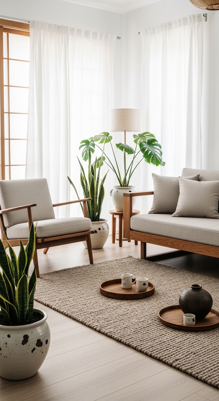
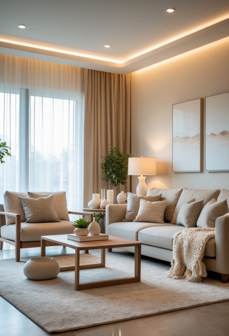
1) Soft Greige for a Timeless Neutral Look
Soft greige combines gray and beige to create a balanced, neutral color. It works well in living rooms by providing a calm, versatile backdrop.
This color suits many styles, from modern to traditional. It pairs easily with other colors and textures.
Using soft greige helps a space feel warm without being too dark or too bright. It offers a timeless look that can grow with changing decor.
2) Deep Emerald Green for a Bold Statement
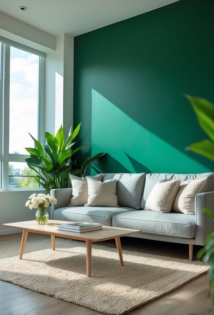
Deep emerald green is a strong, rich color that adds depth to any living room. It works well on walls to create a bold, elegant look without feeling too dark.
People often pair it with neutral colors like white or beige to balance the intensity. It also looks good with gold or brass accents for a touch of luxury.
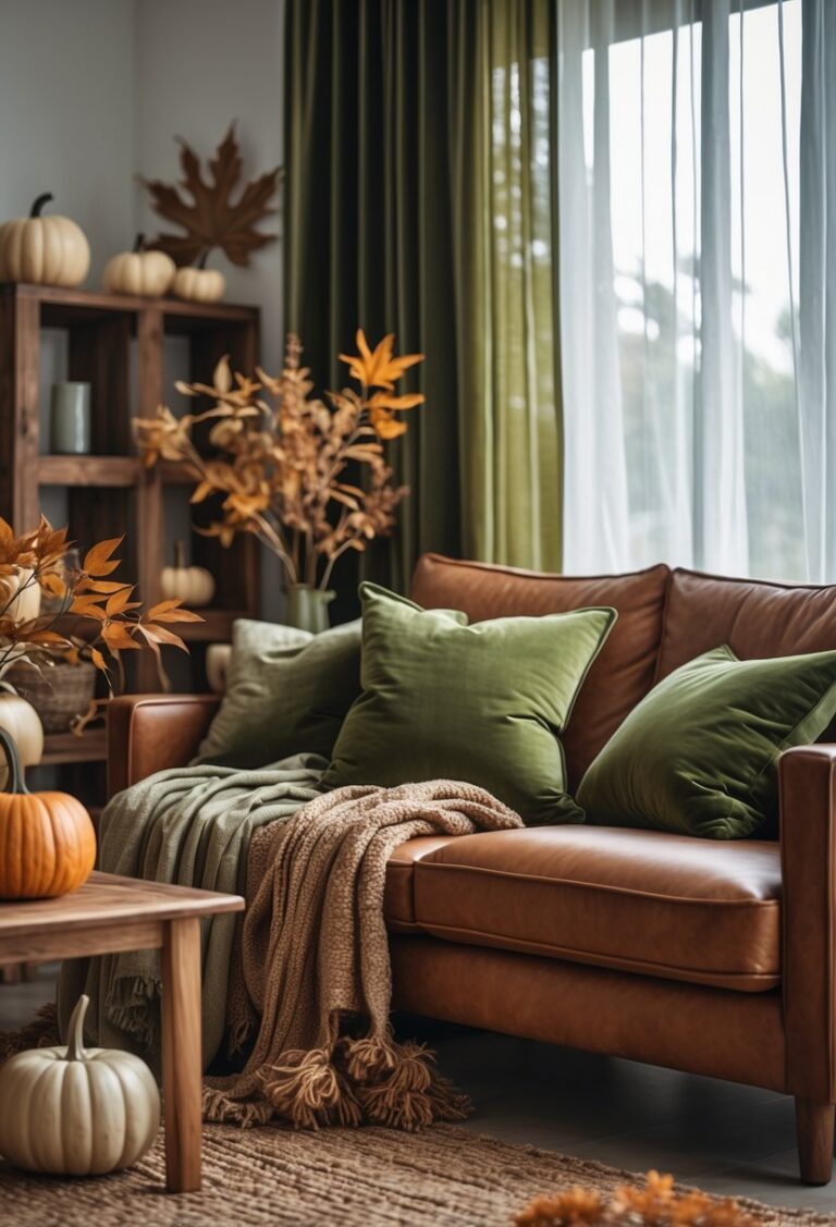
3) Warm Terracotta to Create Cozy Vibes
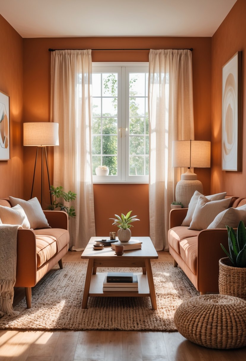
Terracotta is a warm, earthy paint color that adds a cozy feel to any living room. It creates a natural and inviting atmosphere without being too bold.
This color works well with neutrals like beige, sage green, or olive. It can be used on walls or as an accent to add depth.
Using terracotta helps a room feel grounded and comfortable. It pairs nicely with wooden furniture and green plants for a balanced look.
4) Classic Navy Blue for Elegant Sophistication
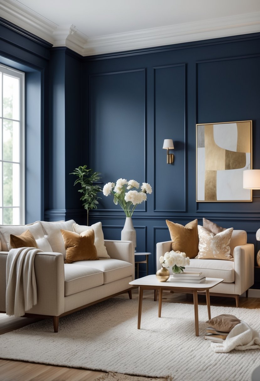
Navy blue is a strong and timeless choice for a living room. It adds depth and a sense of calm to the space.
This color works well with creams, whites, and soft greys, creating a balanced and elegant look.
It also pairs nicely with natural materials like wood and leather. Small touches in brass or gold can enhance the sophistication without overwhelming the room.
5) Muted Sage Green for Natural Calmness
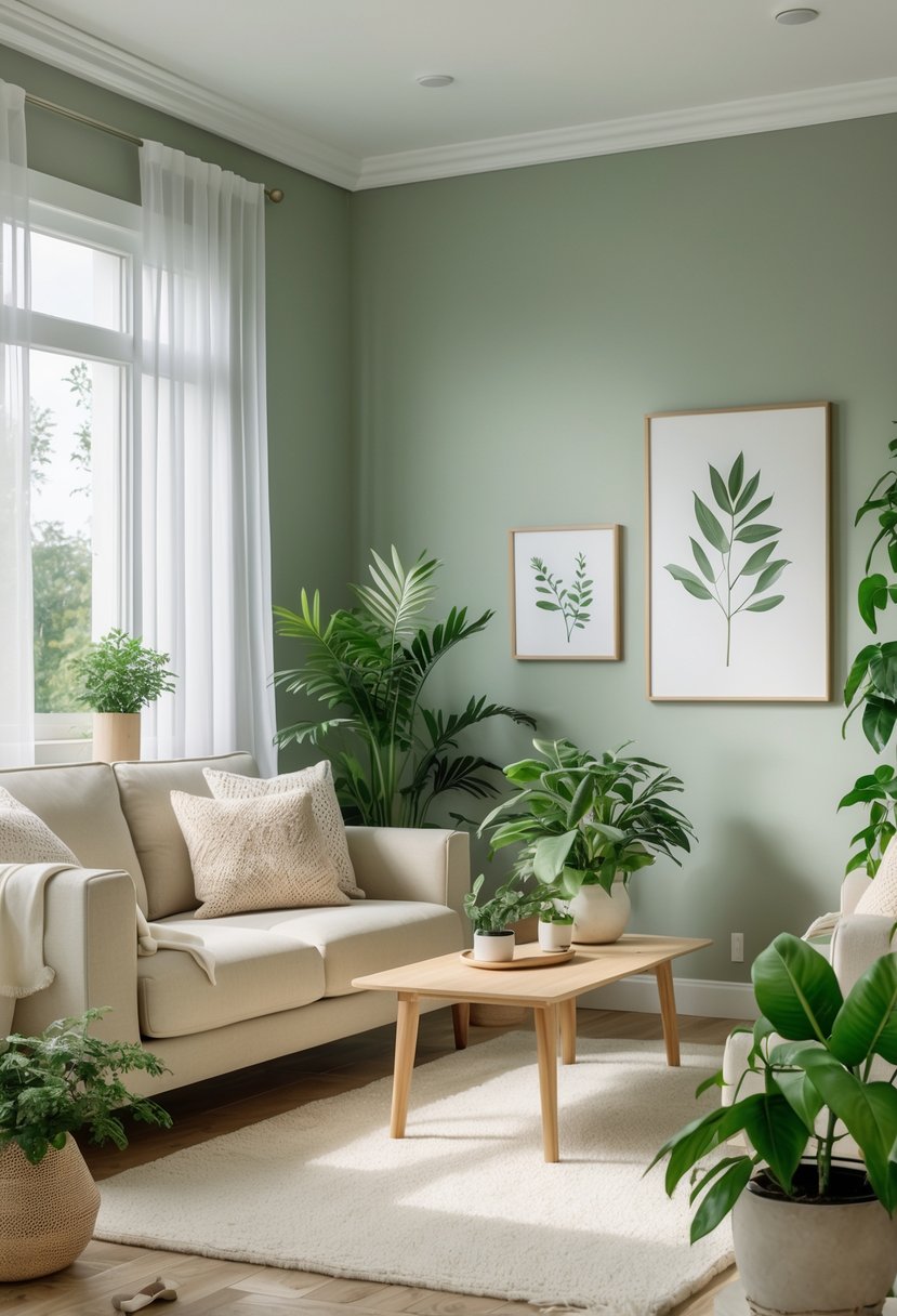
Muted sage green creates a calm and natural feel in the living room. It blends green and gray tones, making the space feel fresh without being too bright.
This color works well with natural wood and soft neutral fabrics. It adds a soothing backdrop that fits both modern and traditional styles.
Sage green is versatile and pairs easily with light yellows or deeper earth tones. It helps create a balanced, restful atmosphere.
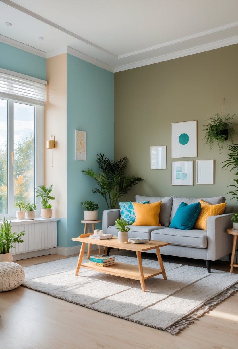
6) Bright Mustard Yellow to Energize the Space
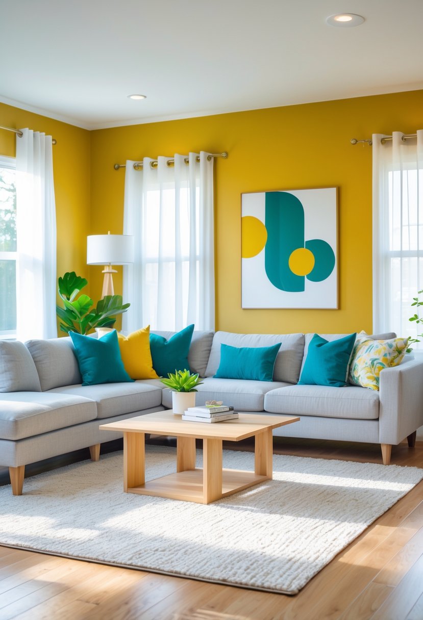
Bright mustard yellow adds energy and warmth to a living room. It works well on an accent wall or through furniture and accessories.
This color brings cheerfulness without being too bright or harsh. It pairs nicely with neutral tones like grey and navy blue to balance the look.
Mustard yellow can highlight a bold personality while keeping the room stylish and inviting. Small gold or brass details add depth to the color scheme.
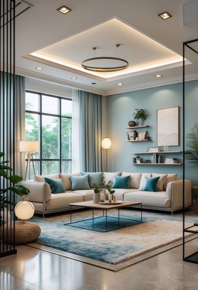
7) Pale Sky Blue for Airy Serenity
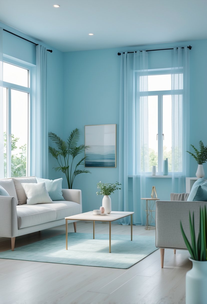
Pale sky blue creates a calm and open feeling in the living room. It reflects light well, making the space feel larger and more inviting.
This color works best with neutral tones like white or beige. It adds a soft, peaceful touch without overwhelming the room.
Using pale sky blue on walls or accents helps build a relaxed, airy atmosphere suitable for any style. It pairs well with natural light and simple décor.
8) Rich Charcoal Gray for Modern Depth
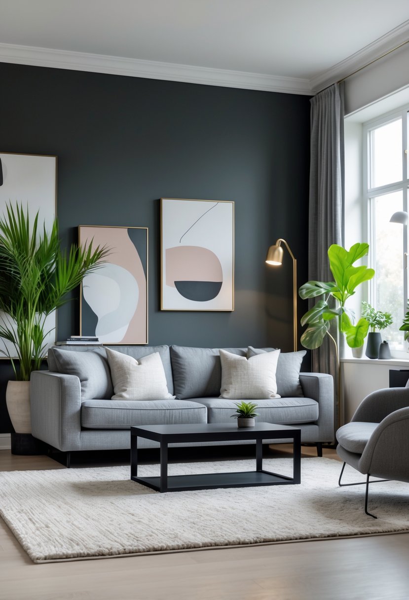
Charcoal gray adds a strong, modern feel to a living room. It gives the space depth without being too dark or overwhelming.
This color works well on walls or as an accent, pairing nicely with lighter furniture. It creates a balanced contrast that keeps the room from feeling heavy.
Charcoal gray also blends well with natural wood tones and off-white accents. This combination adds warmth while maintaining a sleek, sophisticated look.
9) Blush Pink to Add Subtle Warmth
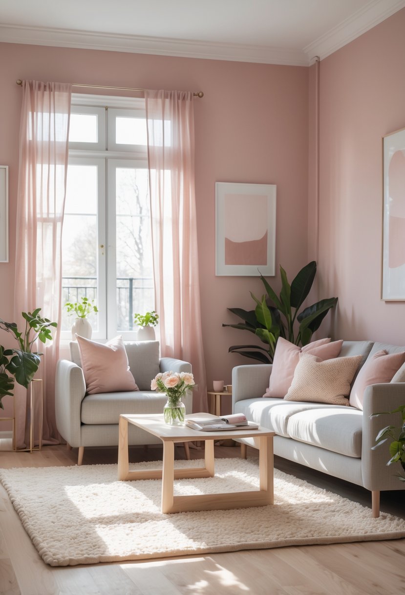
Blush pink is a soft, warm color that brightens a living room without being too bold. It adds a gentle, cozy feeling and works well with neutral tones like beige or brown.
This shade is flexible and can suit modern or traditional styles. It pairs nicely with earth tones to keep the space grounded and inviting. Blush pink creates a calm atmosphere perfect for relaxing.
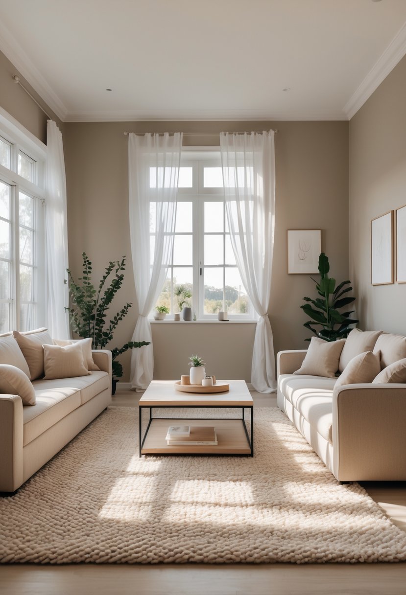
10) Creamy Off-White for Versatile Brightness
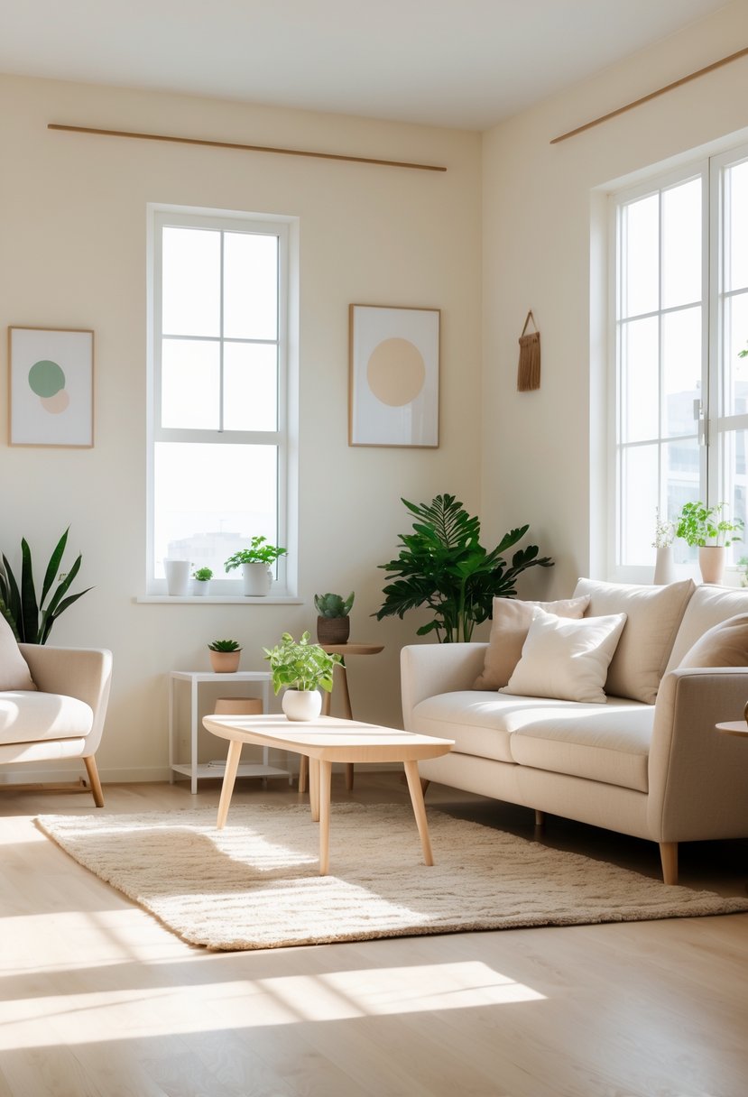
Creamy off-white paint colors work well to brighten living rooms without feeling harsh. They offer a soft, warm look that suits many decor styles.
These shades add subtle warmth, making spaces feel inviting and calm. They pair easily with both modern and classic furniture.
Creamy off-whites often have a slight undertone that changes with lighting. This makes them flexible choices for different times of day and room sizes.
11) Rustic Burnt Orange to Bring Earthy Warmth
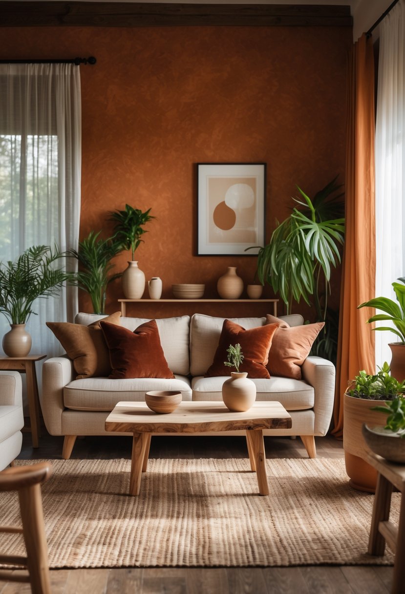
Rustic burnt orange adds a natural, warm feel to living rooms. It blends well with earthy colors like olive green and brown.
This paint choice creates a cozy and inviting atmosphere without being too bright. It works well with wooden furniture and natural fabrics.
Using burnt orange in a rustic style brings balance and depth to the space. It gives the room a grounded, comfortable look.
12) Moody Aubergine for Dramatic Flair
Aubergine is a deep, rich purple that adds drama to any living room. It works well as a bold wall color or an accent shade.
This color brings an artistic and sophisticated touch. It can create a cozy, moody atmosphere without feeling overwhelming.
Pairing aubergine with lighter tones or metallic accents can balance its intensity. It suits spaces where a peaceful yet striking look is desired.
How Paint Color Influences Living Room Atmosphere
Paint colors shape how a living room feels by affecting mood and perceived size. The way natural light hits the room changes how colors look, making some shades work better depending on the direction the room faces.
The Psychology of Color Choice
Colors affect emotions and behavior. For example, blues and greens often create a calm, relaxing atmosphere. Warm colors like reds and oranges can make a room feel energetic or cozy.
Neutral tones such as beige or gray promote balance and work well with many styles. Moody tones like deep grays or dark bronze add sophistication and depth but may feel heavy if used too much.
Choosing paint color based on the mood desired helps make the space function as intended, whether for relaxing, entertaining, or focusing.
Natural Light and Room Orientation Effects
The direction a room faces strongly impacts how paint colors appear. Rooms with southern or western exposure get bright, warm light, which can intensify warm paint colors. Cooler shades like light blues or soft grays balance this strong sunlight and prevent the space from feeling too hot.
North-facing rooms receive cooler, dimmer light year-round. Using warmer tones such as soft whites or warm earth colors helps these spaces feel brighter and more inviting.
Lighting changes through the day also affect perception, so testing paint samples in different lighting conditions is essential.
Tips for Choosing the Right Paint Finish
Choosing the right paint finish affects how a wall looks and performs. Some finishes reflect light and show imperfections, while others hide flaws but may be harder to clean. The choice depends on the room’s use and the desired look.
Matte vs. Satin vs. Glossy Finishes
Matte finishes have no shine and create a smooth, soft look. They work well in living rooms with low traffic because they hide wall imperfections best. However, they can be harder to clean and may wear faster in busy areas.
Satin finishes have a slight sheen that adds depth to walls. They balance appearance with practicality because satin is easier to clean than matte but still hides minor flaws. Satin is a good choice for living rooms where some durability is needed.
Glossy finishes are shiny and reflect a lot of light. They highlight wall details and are very durable and easy to clean. However, glossy paint shows imperfections clearly, so walls must be smooth and well-prepared before use.
Durability and Maintenance Considerations
Durability is important for living rooms that get regular use or have children and pets. Glossy and satin finishes are more resistant to scrubbing and stains than matte finishes. Glossy paint is best for high-traffic walls or areas prone to dirt.
Maintenance depends on the paint’s ability to clean without damage. Satin and glossy paints can be wiped down repeatedly with mild soap without losing color or finish quality. Matte finishes require gentle cleaning to avoid damaging the surface.
Choosing a finish also considers longevity. Glossy surfaces tend to keep their appearance longer under wear. Matte surfaces may need touch-ups more often because they are softer. Satin offers a middle ground for lasting good looks and ease of care.
Frequently Asked Questions
Choosing the right paint color involves understanding current trends, room size, natural light, and how colors work together. The right palette can create a spacious, cozy, or modern feel while matching various decor styles.
What are the top trending paint colors for living rooms this year?
Soft greige remains popular for a timeless neutral look. Deep emerald green is trending for those wanting a bold, rich statement. Warm terracotta adds cozy vibes, while classic navy blue brings elegance. Muted sage green is chosen for a calm, natural atmosphere.
How do I choose the right paint color to make my living room feel more spacious?
Lighter colors like soft greige or pale mint green can open up the room. Avoid dark, heavy colors if the space is small. Using a satin or eggshell finish helps reflect light, making walls look bigger and brighter.
Which paint colors work best for a living room with limited natural light?
Warm terracotta and muted sage green add warmth without needing much sunlight. Soft neutrals like greige brighten dim spaces. Avoid dark blues or deep greens as they can make the room feel smaller.
What are some recommended color palettes for a modern living room aesthetic?
A mix of soft greige with accents of deep emerald or navy works well. Pair muted sage with warm wood tones for a natural modern feel. Crisp white trims with terracotta walls create a clean but inviting look.
Can you suggest some versatile paint colors that work with various living room decors?
Soft greige is highly versatile, complementing both classic and modern styles. Classic navy blue pairs well with neutrals and metallic accents. Muted sage green blends with natural elements and soft fabrics.
How should I coordinate different paint colors when planning a two-tone living room wall?
Use a lighter neutral like soft greige on the top half and a darker color such as deep emerald on the lower half. Ensure the colors balance each other by keeping the finish consistent. Adding trim in a neutral shade can help unify the look.