Fall Color Palette Ideas for Home Interiors: 12 Stylish Schemes to Refresh Your Space
As the seasons change, many people look for ways to refresh their home interiors to match the mood of fall. Colors inspired by autumn bring warmth and comfort into living spaces, creating a cozy atmosphere that suits cooler weather.
Choosing the right fall color palette helps create a welcoming and stylish environment that fits any home. These palettes can blend traditional autumn shades with fresh ideas, offering options that balance nature’s beauty with personal style.
1) Crisp Blue and Golden Yellow Combination
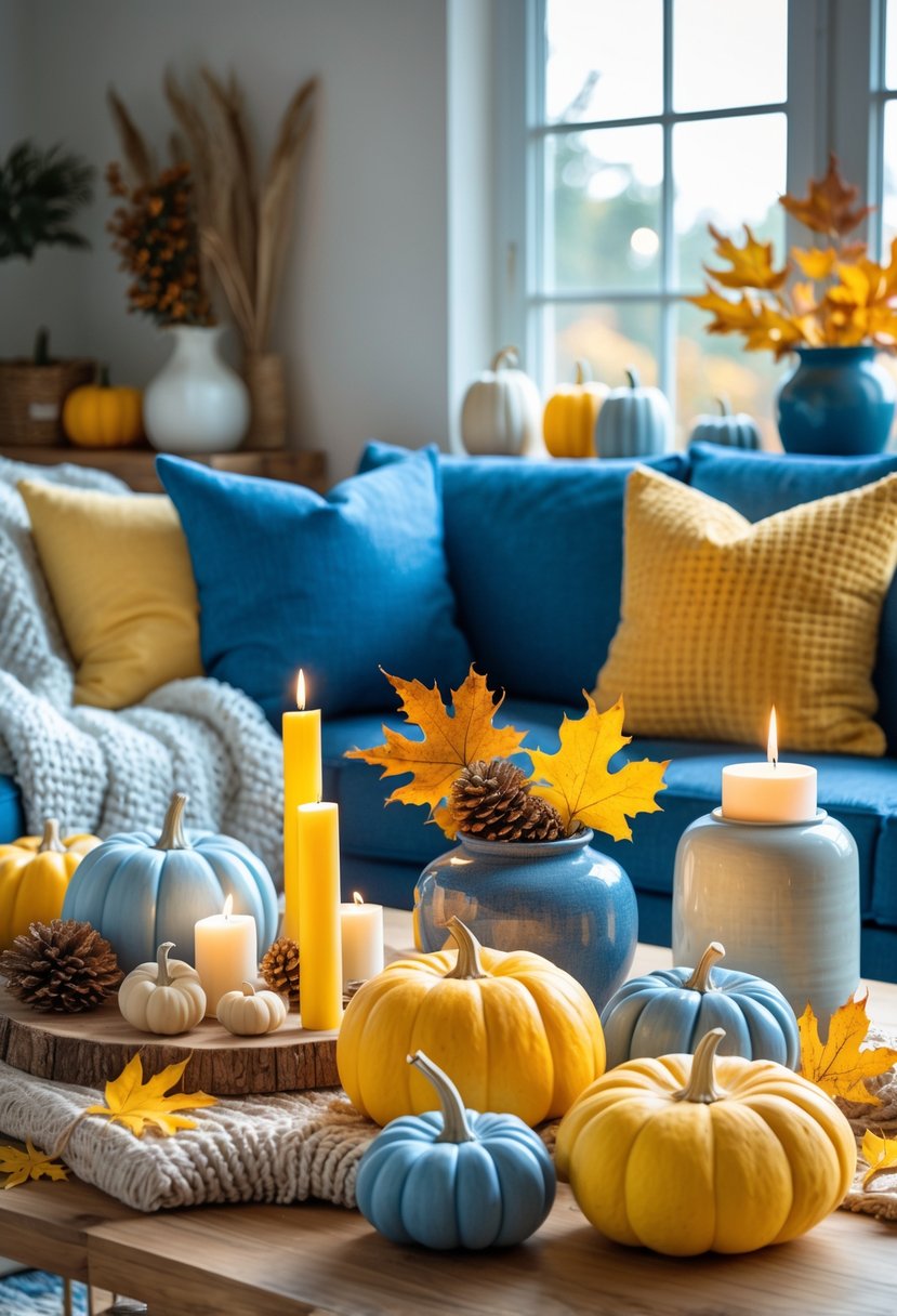
This color pairing brings freshness to fall design. The crisp blue recalls clear autumn skies, adding cool contrast to warm tones.
Golden yellow evokes the look of changing leaves and sunlight. Together, these colors create balance and keep a room bright.
Using neutral accents helps soften the contrast. This palette works well for living rooms and kitchens, offering both energy and warmth.
2) Terracotta and Rich Ochre Mix
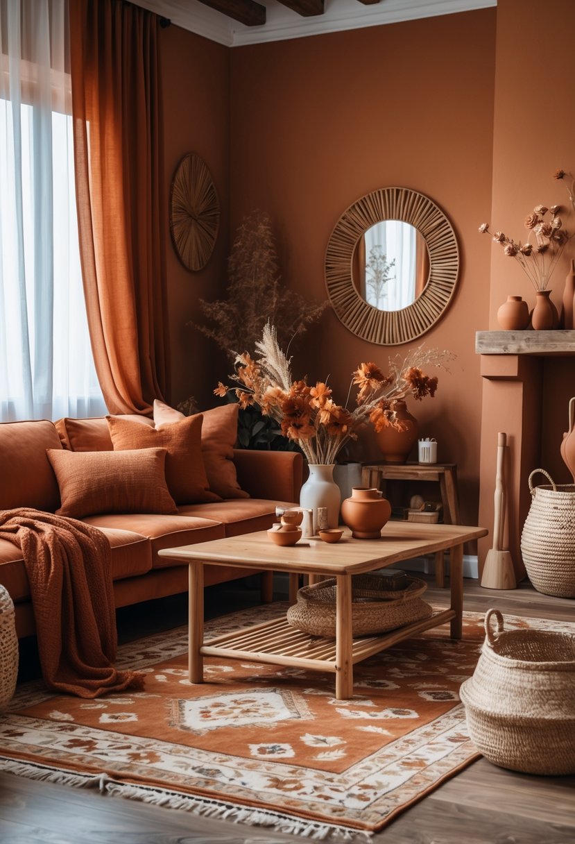
Terracotta and rich ochre create a warm and earthy feel in home interiors. These colors work well together because they both have natural, clay-like tones.
They add depth without overpowering a space, making rooms feel cozy and inviting. Using terracotta on walls with ochre accents in furniture or decor can balance warmth and brightness.
This mix fits well in bohemian or rustic styles and pairs nicely with natural textures like wood and ceramics.
3) Dusky Browns with Soothing Sage
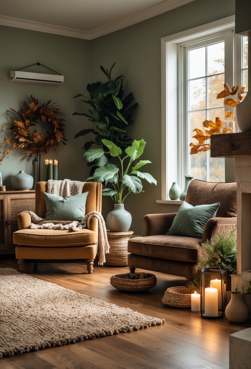
Dusky browns bring warmth and depth to a space. They work well as wall colors or furniture tones.
Soothing sage adds a calming, natural feel. It balances the richness of brown without overwhelming the room.
Together, these colors create a restful, inviting atmosphere. This palette suits living rooms or bedrooms looking for subtle elegance.
4) Fiery Red Accents with Neutral Base
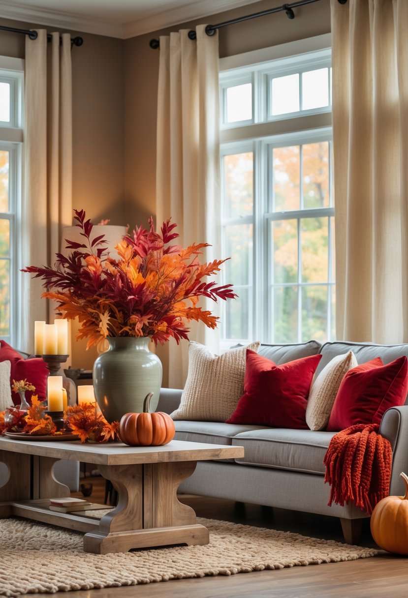
Using a neutral base creates a solid foundation for a room’s color scheme. Soft shades like cream, beige, or light gray work well to balance brighter tones.
Fiery red accents add warmth and energy without overwhelming the space. They can appear in pillows, throws, or small decor items.
Layering different neutral hues adds depth, while the red elements draw the eye and create a welcoming feel. This combination suits many styles, from modern to traditional.
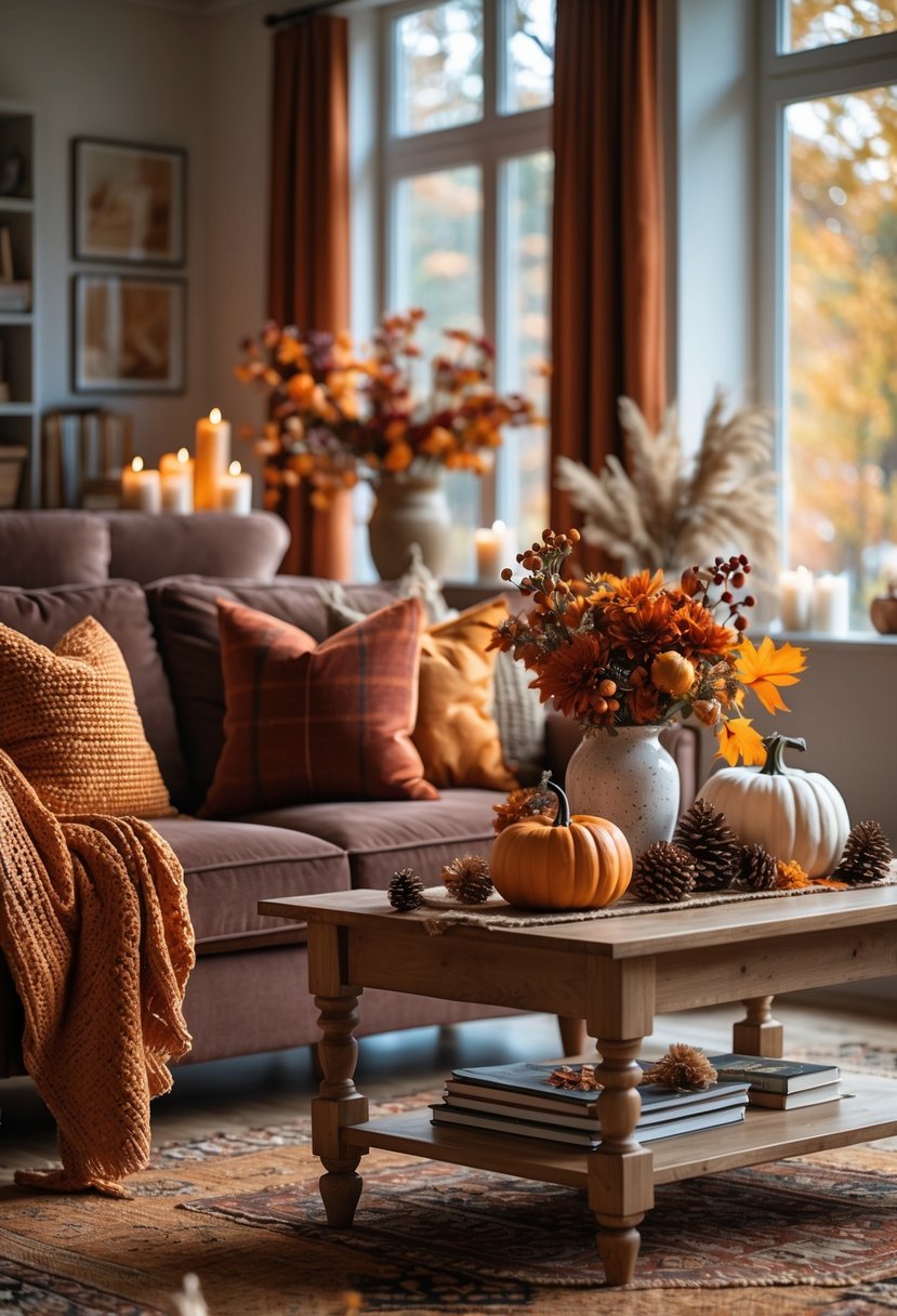
5) Warm Pumpkin Orange and Cream
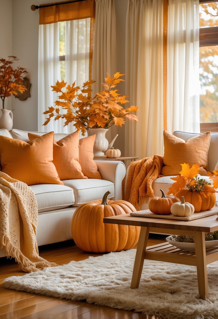
This palette pairs warm pumpkin orange with soft cream tones. It creates a cozy and inviting atmosphere in any room.
The bright orange adds energy, while the cream balances it with calm and lightness. Using these colors together works well on walls, furniture, and decor.
This combination fits well with fall-themed interiors and brings warmth without overwhelming the space. It is simple, yet effective for seasonal home updates.
6) Deep Navy with Soft Lavender
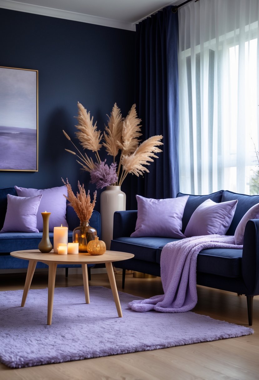
This color pairing blends the richness of deep navy with the calmness of soft lavender. It creates a balanced atmosphere that feels both strong and soothing.
The deep navy adds depth and warmth, ideal for larger pieces like walls or furniture.
Soft lavender works well in accents such as pillows, curtains, or rugs, adding a subtle touch of color without overwhelming the space.
Together, they offer a modern twist on traditional fall colors.
7) Burnt Sienna and Mustard Yellow
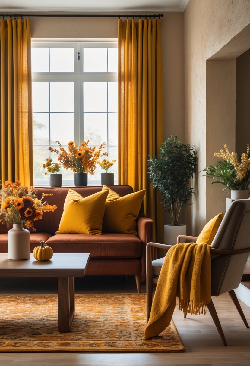
Burnt sienna and mustard yellow work well together in fall interiors. Burnt sienna adds a deep, earthy tone that feels warm and grounding.
Mustard yellow brings a bold, cheerful touch that brightens the space without overwhelming it.
Together, these colors create a balanced look that fits styles like vintage, bohemian, or mid-century modern. They evoke a cozy, inviting feeling perfect for autumn.
8) Olive Green Paired with Rustic Browns
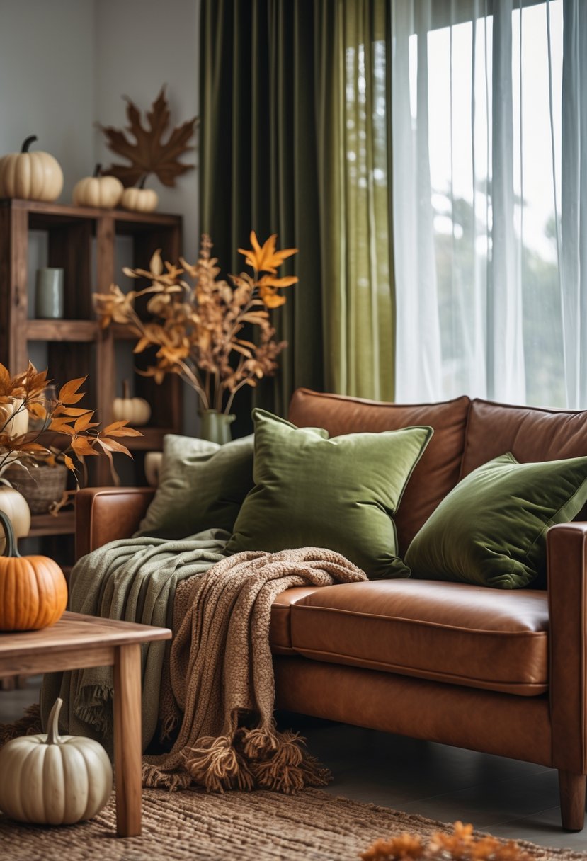
Olive green works well with rustic browns to bring a natural, warm feeling indoors. This combination creates a grounded and cozy atmosphere.
Using different shades of brown, like deep chocolate or soft tan, adds depth while keeping the look balanced. Textures such as wood and woven fabrics enhance the natural appeal.
This palette is ideal for fall. It reflects the colors of the outdoors and fits well in living rooms, kitchens, or bedrooms.
9) Copper Tones with Warm Gray
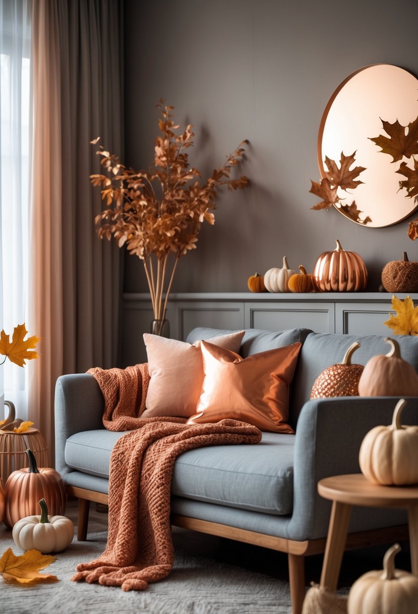
Copper tones bring warmth and richness to any room. When paired with warm gray, they create a balanced and sophisticated look.
The warm gray tones soften the brightness of copper. This combination works well in living rooms and kitchens for a modern yet cozy feel.
Together, these colors add depth without overwhelming the space. They provide a subtle contrast that highlights copper accents beautifully.
10) Mocha Brown and Soft Peach Blend
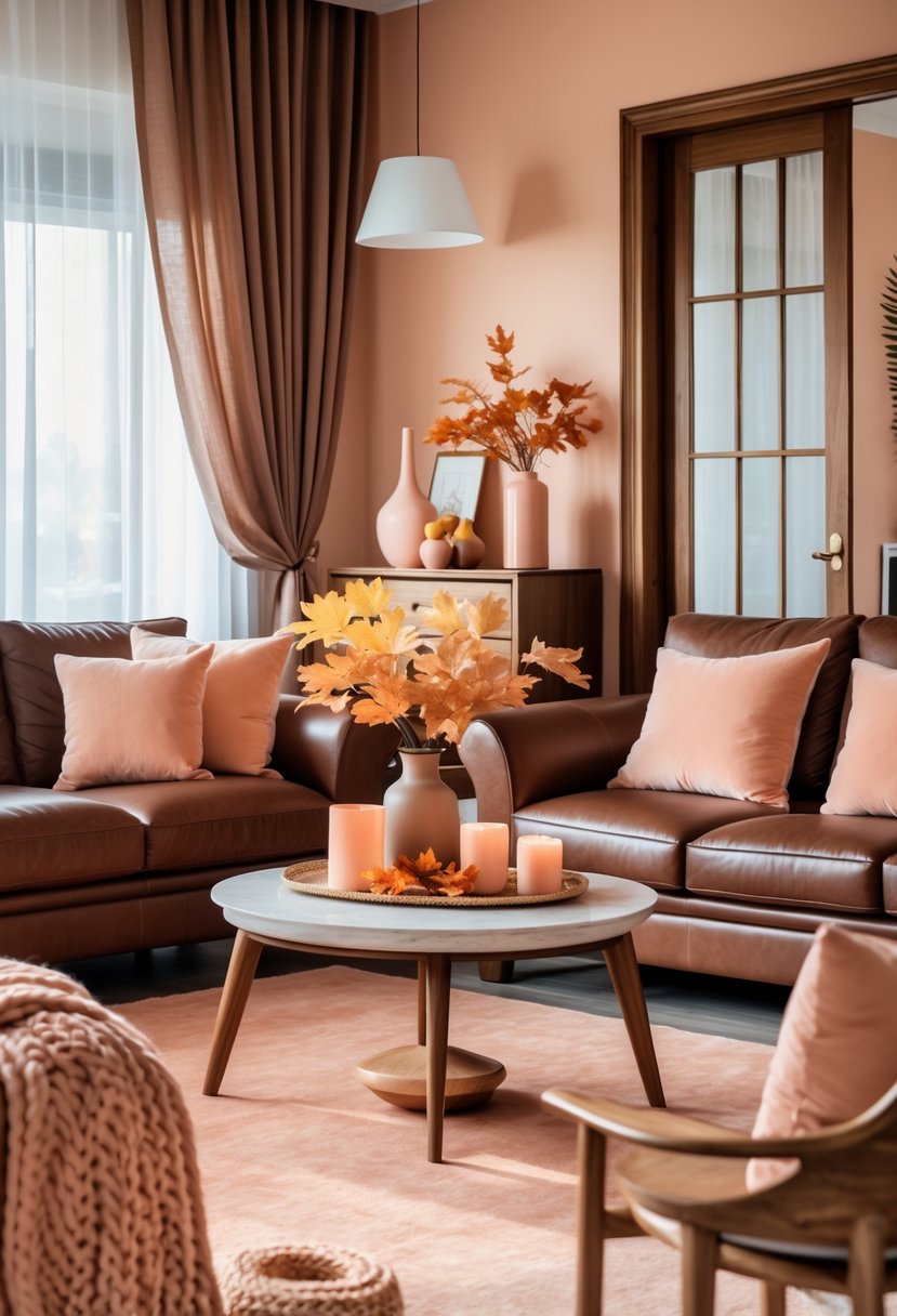
This color mix creates a warm and inviting space. Mocha brown adds rich, earthy depth, while soft peach brings a gentle, calming touch.
The combination works well in living rooms and bedrooms, balancing dark and light tones.
It suits both modern and classic styles, offering comfort without feeling dull. Adding this blend can refresh interiors easily for fall.
11) Rust and Burgundy Contrast
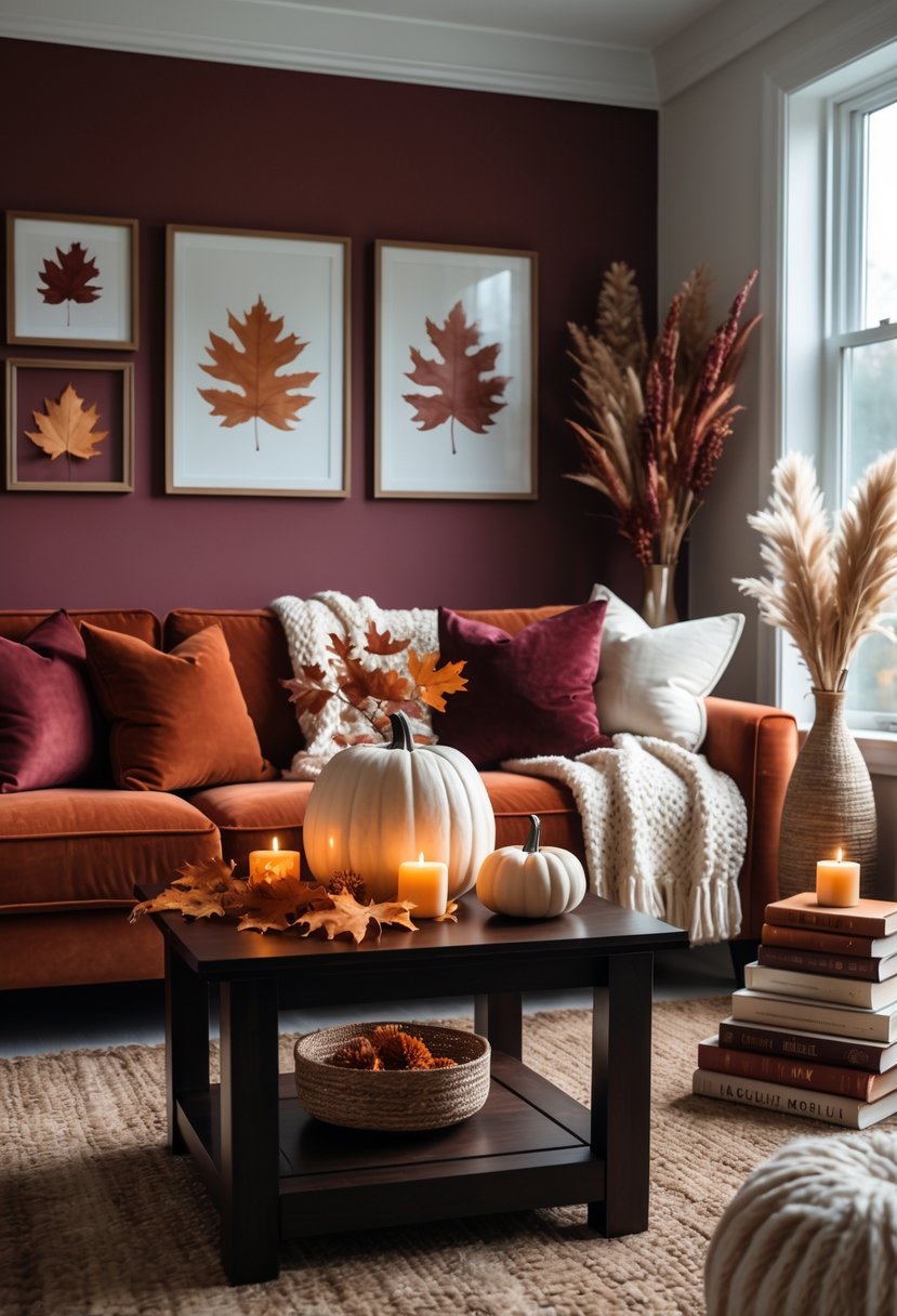
Rust and burgundy create a rich and warm color combination. The deep red of burgundy pairs well with the earthy orange tone of rust.
This palette adds depth and a cozy feeling to spaces like dining rooms or living areas. The contrast is strong but balanced, making rooms look inviting without being too bright.
12) Soft Taupe with Muted Gold Highlights
Soft taupe creates a calm and warm base for any room. It works well on walls, furniture, or rugs.
Adding muted gold highlights brings a subtle glow without being too bright. These touches can appear in lamps, pillows, or small decor items.
Together, soft taupe and muted gold give a space gentle warmth and timeless elegance. The combination suits living rooms and bedrooms for a cozy, inviting feel.
Understanding Fall Color Palettes
Fall color palettes often blend rich, warm hues with calming neutrals. These combinations bring a sense of warmth and comfort into home interiors. Choosing the right balance can highlight the cozy spirit of autumn while keeping spaces versatile and inviting.
Warm Tones and Their Impact
Warm tones like deep reds, burnt oranges, golden yellows, and rich browns capture the essence of fall. These colors add energy and a feeling of warmth to a room. Using them in accents such as pillows, throws, or rugs can create a cozy atmosphere without overwhelming the space.
In larger doses, warm tones work well on walls or furniture, especially in rooms that receive less natural light. These hues can make spaces feel more intimate and grounded. The key is to select colors that complement each other. For example, pairing burnt orange with a muted gold can enhance warmth without clashing.
Balancing Neutrals With Autumn Hues
Neutrals like soft grays, creams, and taupes help balance bold fall colors. These shades act as a calm background that allows warm tones to stand out without making a room feel too dark or busy.
Integrating neutrals into walls, flooring, or large furniture pieces offers a flexible base. Adding pops of autumn colors through pillows, curtains, or art then becomes easier. This approach also helps maintain a timeless look in the home, allowing seasonal accents to be swapped out without major redecorating. Using natural materials like wood or linen alongside neutrals enhances the earthy, autumn vibe.
Incorporating Fall Colors in Different Spaces
Using fall colors thoughtfully can enhance rooms of all sizes and layouts. Adjusting tones and patterns helps maintain balance. Connecting colors across areas can create a smooth flow within a home.
Adapting Palettes for Small Rooms
In small spaces, choosing the right fall colors is key to avoiding a cramped feel. Lighter tones like soft sage or muted ochre work well because they open up the room visually.
Use accent pieces in richer colors, such as terracotta pillows or a deep rust rug, to add warmth without overwhelming the space.
Keeping walls and large furniture in neutral or pale fall shades helps maintain light and airiness.
Patterns should be simple and in smaller scales to avoid making the room feel cluttered. Incorporate texture through fabrics or small décor items to add depth.
Creating Cohesion in Open Floor Plans
Open floor plans need color flow to connect living, dining, and kitchen areas. Choosing a consistent base palette helps unify the space.
Select a few main fall colors and repeat them in different forms — like a navy throw in the living room matched with navy dining chairs.
Use accent colors like rich ochre or deep brown strategically in décor items, artwork, or textiles throughout the space.
To add dimension, mix warm hues like rusty red or terracotta with cooler tones such as soft lavender or muted navy. This keeps the space feeling balanced and interesting.
Furniture styles and finishes should complement the color palette for a cohesive look across rooms.
Frequently Asked Questions
Fall color palettes for home interiors focus on warm, earthy tones and versatile combinations. These include mixes of rich oranges, muted greens, and soft neutrals to create inviting and balanced spaces.
What are the top trending paint colors for living rooms this fall?
Terracotta and rich ochre remain popular for living rooms this season. Crisp blue paired with golden yellow is also trending, offering a fresh yet cozy contrast.
How can I incorporate a fall color palette into my home decor?
Using accents like throw pillows, rugs, and curtains in warm pumpkin orange, creamy tones, and dusky browns can introduce fall colors without major changes. Layering these with neutral bases helps keep the space balanced.
Which colors best capture the essence of autumn for interior design?
Warm pumpkin orange, terracotta, rich ochre, dusky browns, and soothing sage capture autumn’s natural feel. Fiery red can add vibrancy when used in small doses.
What are some fall-inspired decorating ideas for my living space?
Incorporate natural textures like woven baskets and wooden elements. Use cozy textiles in shades of cream and orange combined with accents in gold or deep green.
How can I update my home’s interior with fall colors without a complete redesign?
Swap out small decor pieces such as cushions, artwork, and throws. Introducing a soft autumn color palette through accessories creates warmth and seasonal feel without repainting or changing furniture.
What are the emerging color trends for home interiors this autumn?
Mixing dusky browns with soothing sage is gaining popularity. The pairing of crisp blue with golden yellow also emerges as a fresh twist on traditional fall colors. These options blend timeless autumn tones with a contemporary touch.